Coloring line art is surprisingly fun and easy. All that's needed is the GNU Image Manipulation Program (GIMP), and any ol' piece of line art you want. Even a grainy phone picture of a doodle on a yellow legal pad can be cleaned up for coloring if you've got a little patience. On this page I'll walk through the process I've been using with GIMP 2.10.30.
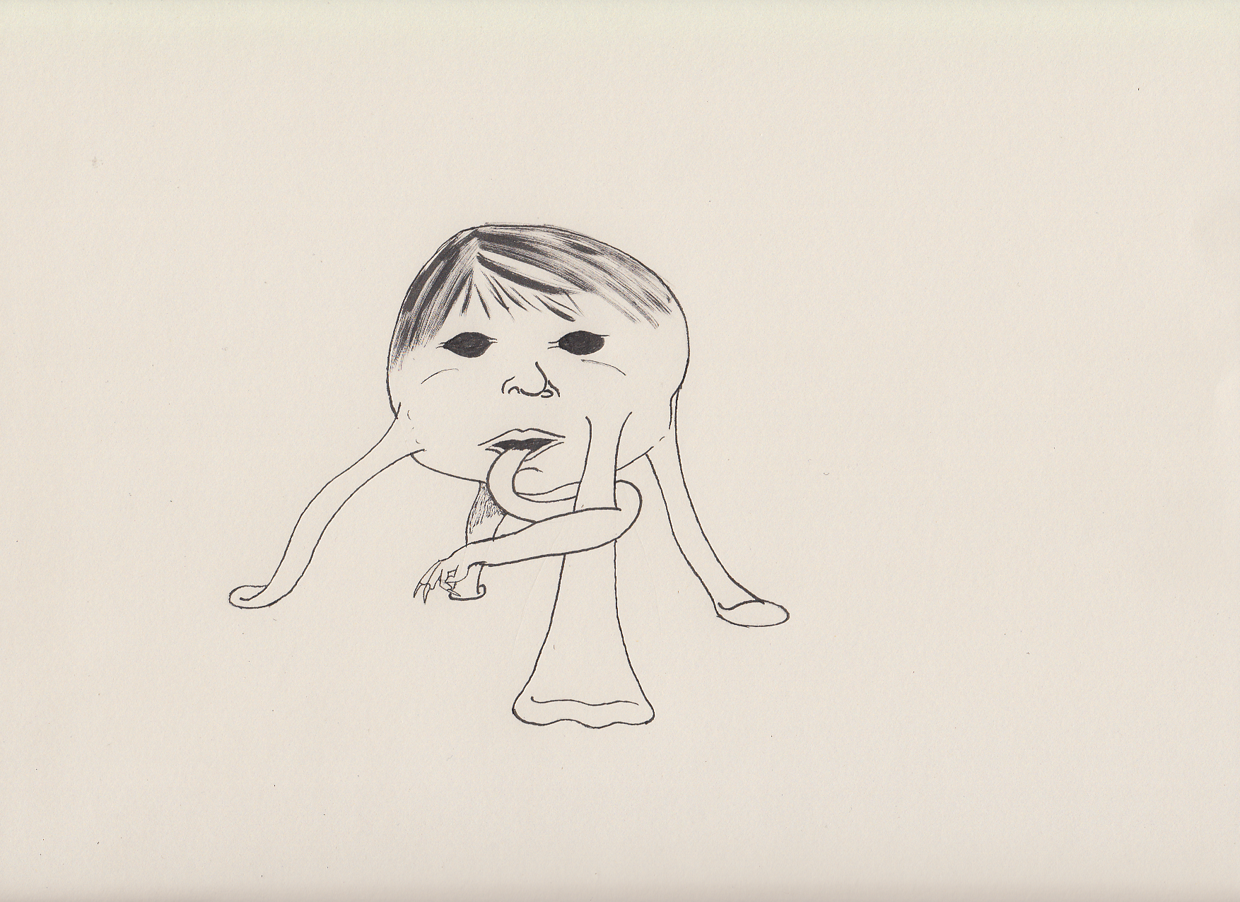
This is the piece I'm starting with: a drawing of a giant baby head monster I doodled for a D&D game back in 2015 or so. I'm hoping that with a little color I can reuse it as a margin illustration for an essay about monster design.
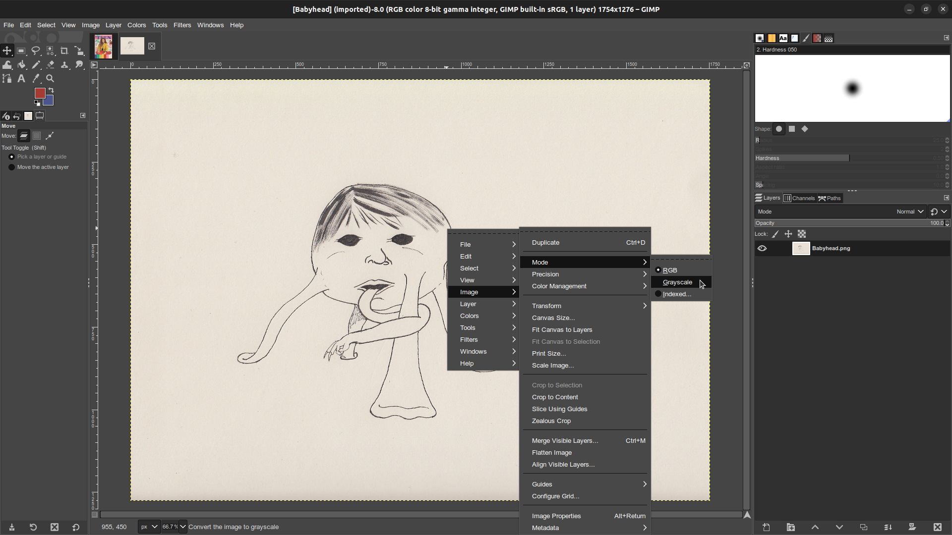
In GIMP, navigate to Image > Mode > Greyscale to get rid of all the color in the image. It may look like it's already B&W, but when I zoom in on the hair you can plainly see a veritable rainbow of browns, reds, and blues.
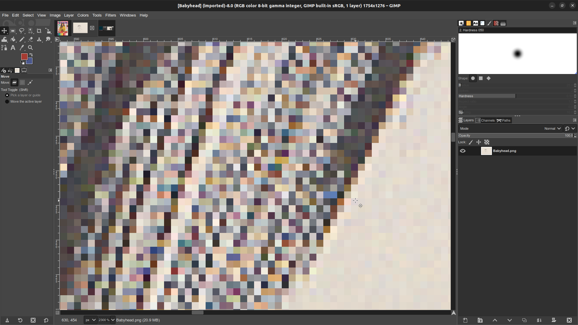
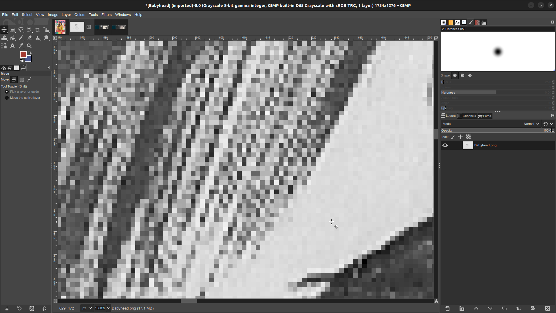
After converting the image to Greyscale all those colors become shades of grey. Easier to work with, but there are too many of them! I need fewer shades of grey.
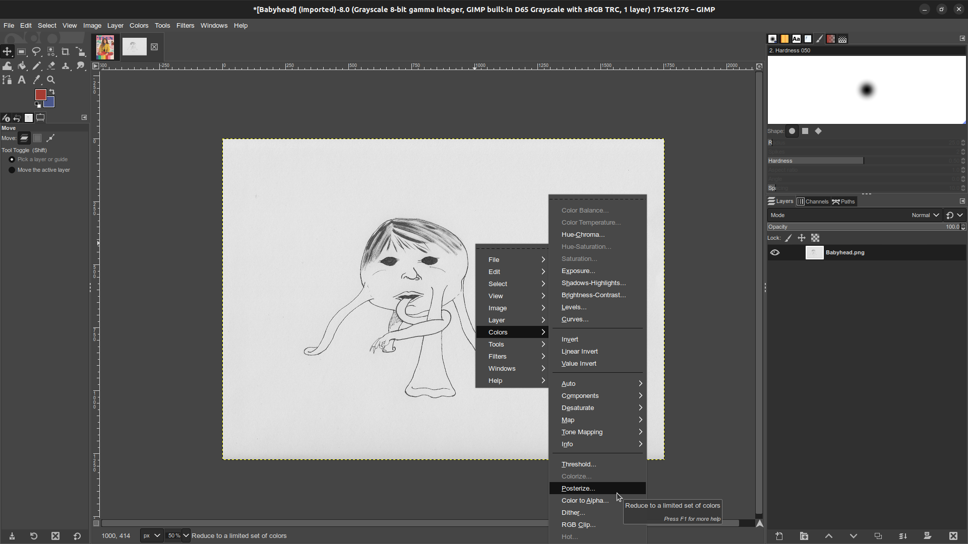
Navigate to Colors > Posterize… This tool allows me to set a hard limit on the number of colors in the image, and automatically recolors every pixel to fit within that limit. So if I were to set Posterize to 2, then every pixel would be changed either to Black, or to White. If I set it to 3 they'd either be Black, White, or a single shade of Grey, etcetera.
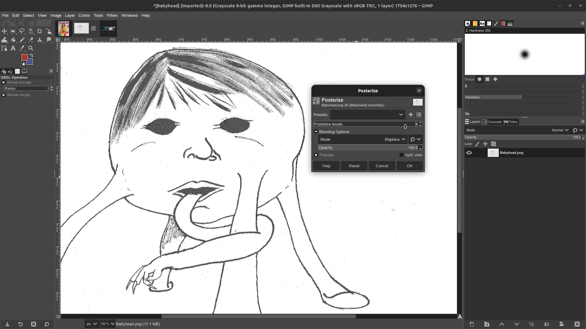
Usually I posterize to 3, but that won't work for this image. The light whispy hairs across the forehead all disappear into white if it's set to 3. Instead I'll posterize to 4. This makes the whispy hairs light grey. Unfortunately it also makes a lot of stuff which ought to be black into dark grey, but that's an easy problem to fix later on.
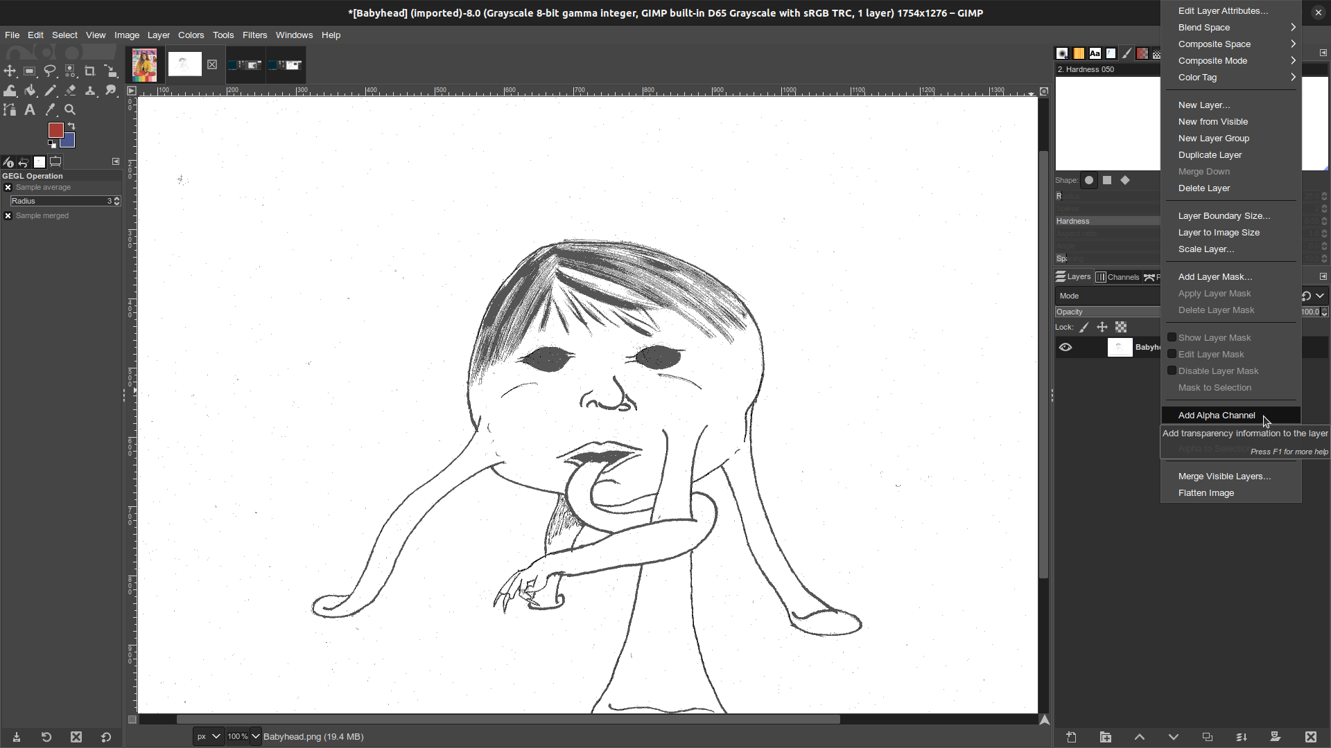
In the Layers panel to the right side of the image, Right Click on the layer and select "Add Alpha Channel." This allows the image to have transparencies in it, and we're going to need those later on. If "Add Alpha Channel" is greyed out that just means this image already has an Alpha Channel.
I could have done this at any point, this just happens to be when I remembered to do it.
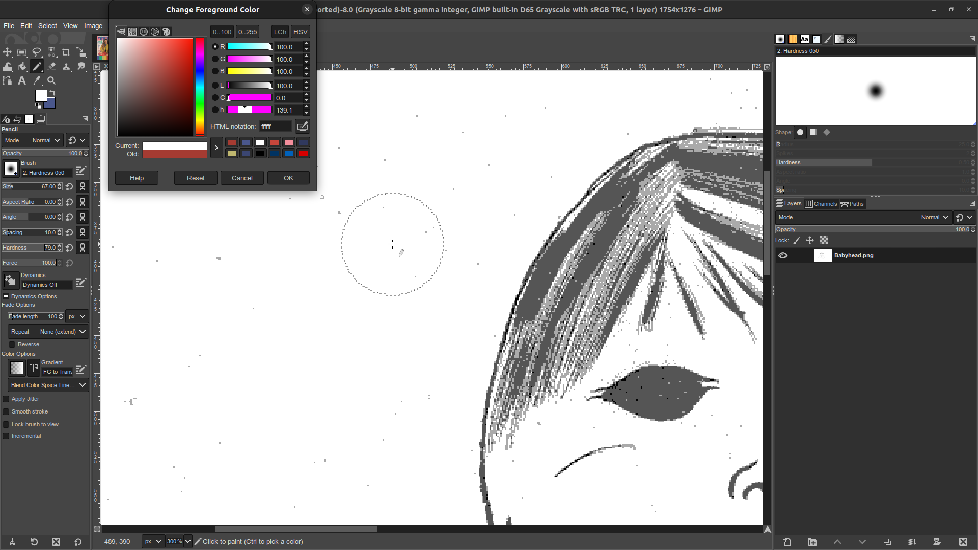
Automation can only take this so far. The image is covered in little specks of grey in areas which ought to be white, so at this point I'll manually clean them up with the pencil tool¹. I start with a very large cursor to quickly paint around the edges. As I move closer to the lines I want to preserve I make my cursor smaller, and zoom in so I can be more precise. (Ctrl+Alt+Scroll is a useful shortcut for adjusting cursor size!) During this step I also repaired an old eraser smudge on the fingers of the tongue-hand.
¹ Not the brush tool, mind you! They're very similar, but the brush has a blending radient around its edge. This can introduce new and unintended shades of color into an image, which is exactly what we're trying to avoid at the moment.
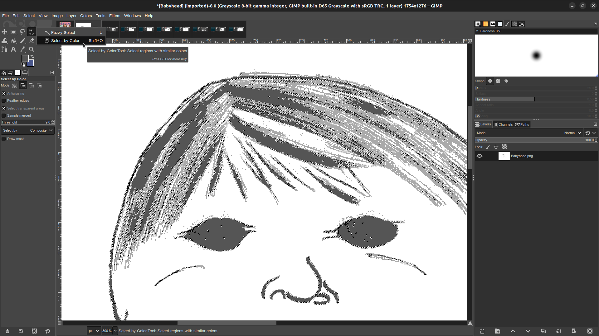
Now that all those errant specks are gone it's time to fix the dark grey that came from posterizing to 4. Like I said above, all that really ought to be stark black. I fix this with the Select by Color tool. Note that GIMP stacks tools of similar types, so Select by Color may be hidden under the Fuzzy Select tool. If so, just right click on Fuzzy Select to bring up a little menu for choosing between them.
Tool in hand, I can just click on any area of dark grey, and now every dark grey pixel on the whole image is selected.
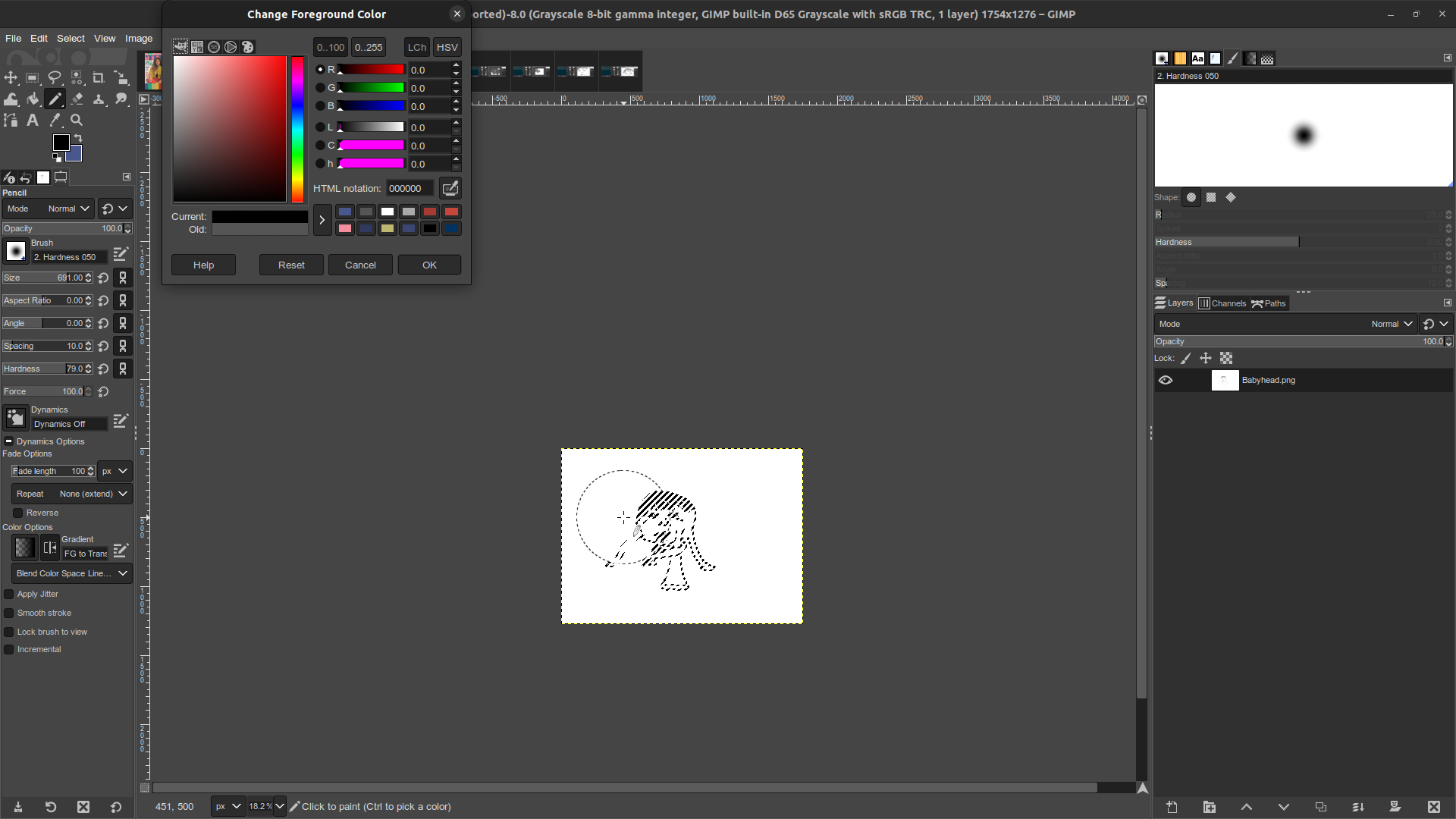
When an area is selected in GIMP, only the selected area can be drawn in. So I can zoom way out, select a huge cursor size for my pencil, and scribble black all over the image to quickly change all the dark grey into perfect black. Once I'm done I hite Ctrl+Shift+A to un-select everything on the image.
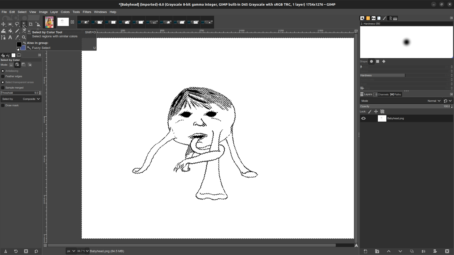
Now I repeat the same process, but this time I use the Select by Color tool to grab all of the White pixels in the image.
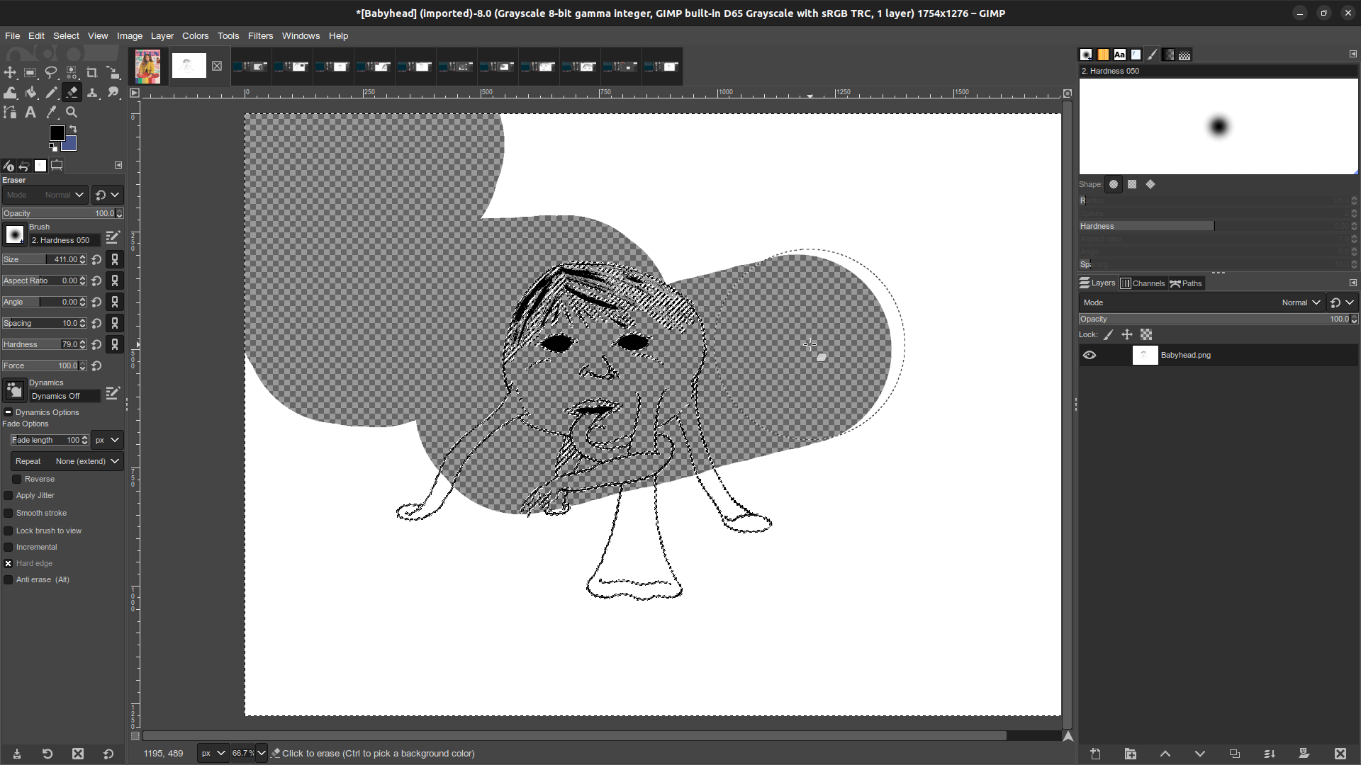
And with a big eraser all the white gets removed from the image, leaving the linework floating in a transparent field. Once again I hit Ctrl+Shift+A to un-select everything.
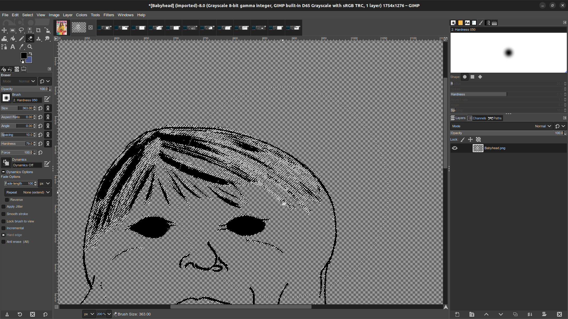
Now I repeat the process yet again: Select by Color on grey, and the eraser tool to get rid of all of it. But, I do not hit Ctrl+Shift+A this time. I want to keep this selection active for awhile.
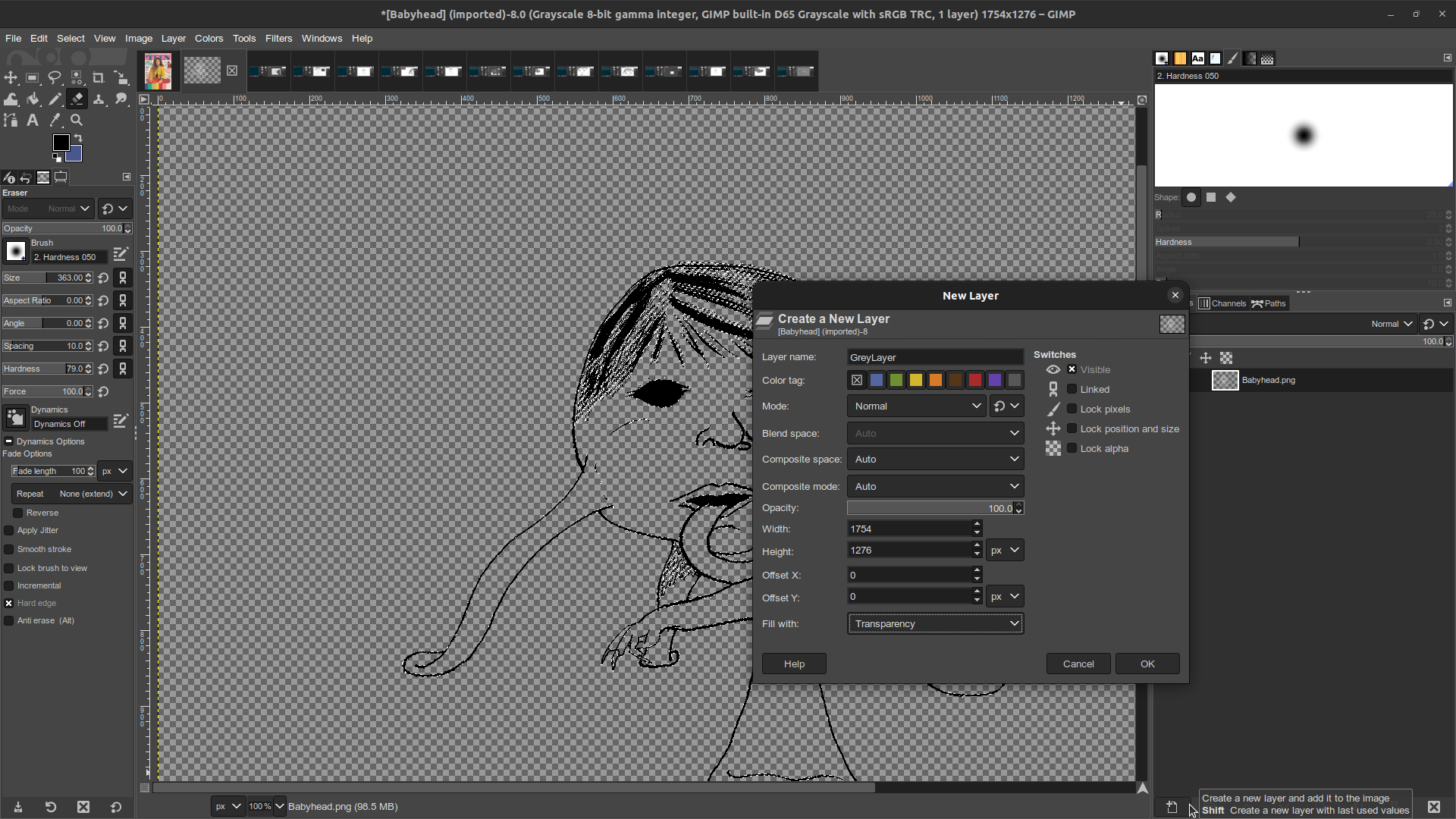
Back in the Layer panel I create a new layer, and select "Fill with Transparency."
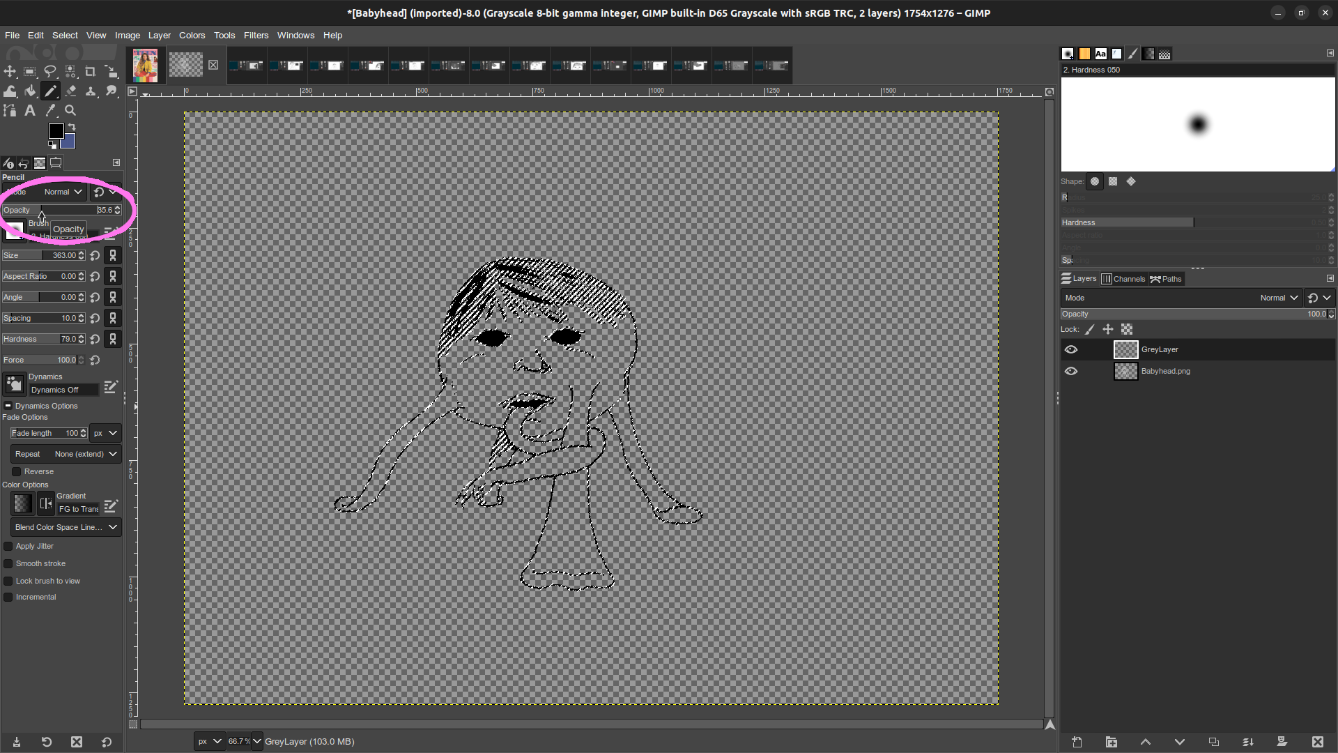
With the new layer selected (It is the "Active Layer,") I change my tool back to a pencil, and set the color to black. In the tool options I set the pencil's opacity somewhere between 30~40%. This bit is circled in pink in the image above. Once again I set my cursor to a large size and scribble all over the image to fill all of the selected space with partially transparent black. This will merge with whatever color I put under it later on. It makes the lines look much more natural to me.
Note: the whole image needs to be done with a single stroke. If you release the mouse button and start a second stroke, the two layers of opacity will stack with one another. This looks bad.
Follow-up Note: I just realized the bucket fill tool has a "Fill whole selection" option, which can be used in place in place of scribbling with a big brush. This might be more efficient in basically every instance where I want to alter the color of a whole selection, but would make this step in particular much more straightforward.
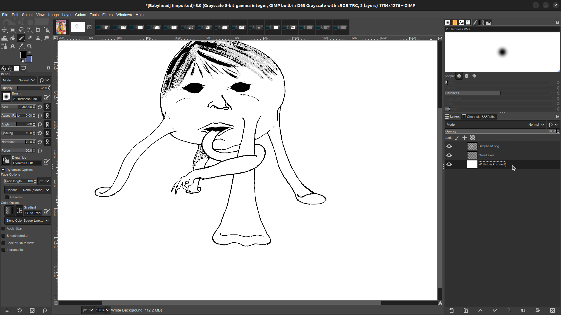
That checkerboard pattern that represents transparency is unpleasant to look at. Create another new layer, this time with "Fill with White" selected. Move that layer to the bottom of the layer stack. Now the image looks basically the same way it did right after we corrected the black, but now all the various elements are on different layers.

It's very nearly time to color, but the image is still locked into greyscale! Return to Image > Mode > RGB to begin the fun part!
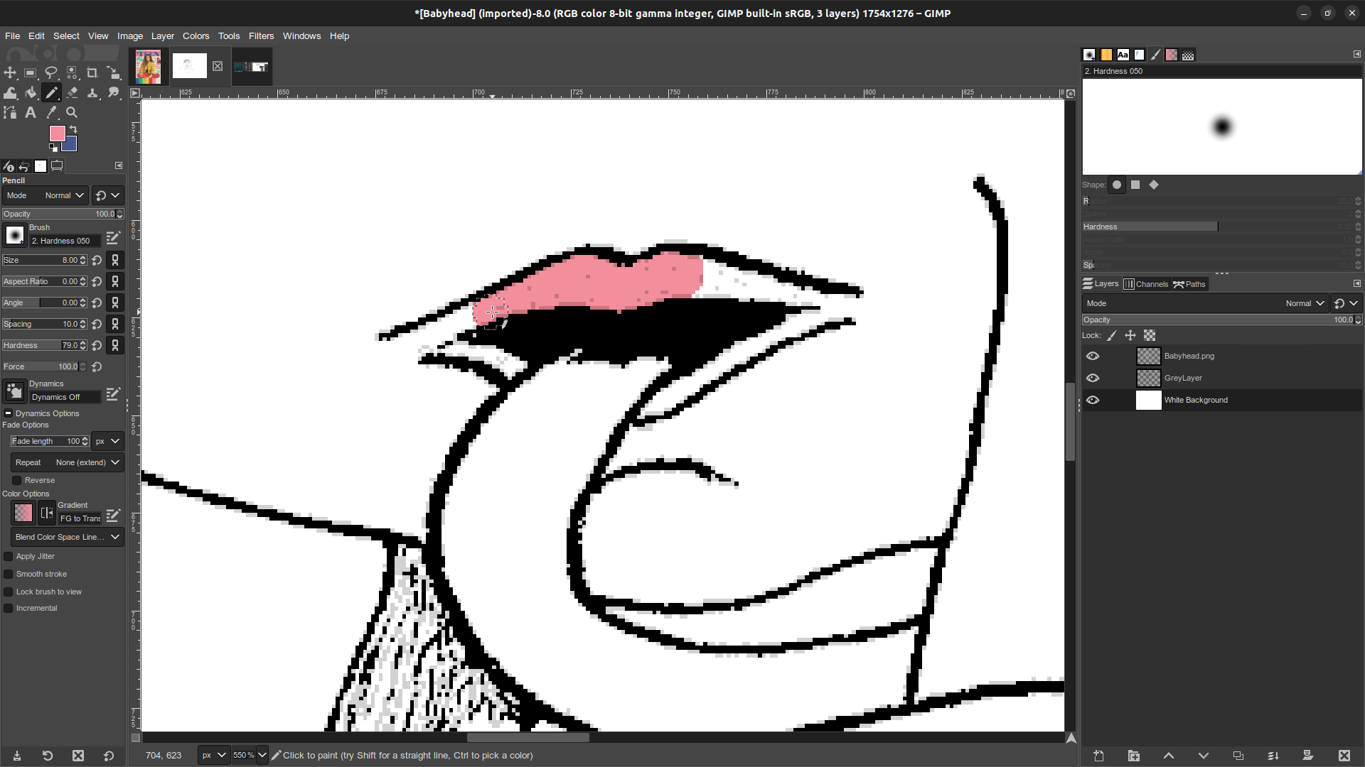
With the white background as the active layer, I can begin coloring with whatever palette strikes my fancy. Because the color is being added underneath the lines it's easy to cleanly fill an area without disrupting the art. If I ever do stray outside the lines it's equally easy to move my pencil cursor to a bit of white and Ctrl+Click to switch my pencil to that color, then use it to cover up my mistake. This is also useful for shaping the ends of a patch of color when it won't be bounded within lines. The corners of these lips are a good example of that.
Pro tip: When there's a large area which all ought to have the same color, you can sometimes switch the active layer back to the line work. Then use the fuzzy select tool to grab that space, then move back down to the white layer and use the bucket fill tool. It doesn't always work because spaces aren't always as fully enclosed as they appear to be, but when it works it can be a big time saver.

Here I've applied all my flat colors, but mediocre line art like this would really benefit from a bit more depth. I'll do this by adding another new layer between the white background and the 35% Opacity lines. Using the color picker I start with the existing colors, but pick a shade a few steps closer to black. Using this to add some shadows can be a big help. Sometimes I'll also pick a third color, a few steps brighter than the base color, for highlights. I've personally had mixed results with that so far, though. I couldn't find a way to make it look good here.
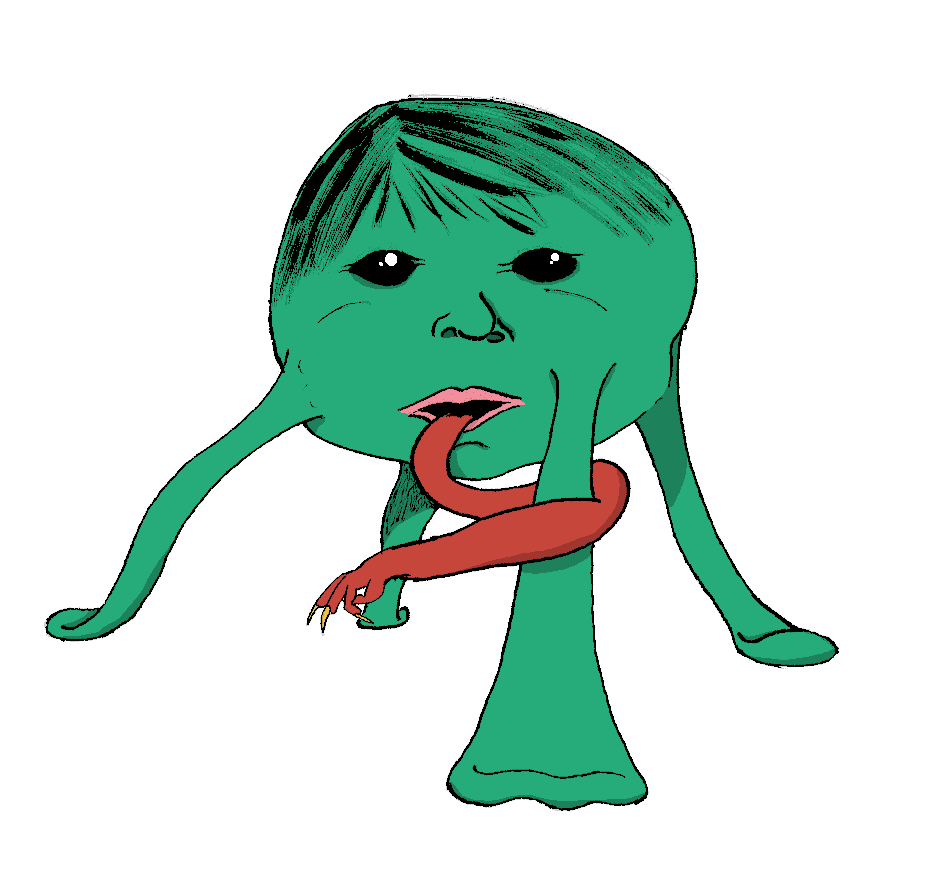
The completed piece. At the last minute I decided to add a bit of shine to the eyes for added creepiness. Just a couple big white dots with a couple small white dots. In the end it's not the best coloring job I've done, but I'm reasonably satisfied that it'll do the job I wanted it for. More than anything, coloring it was a pleasant way to pass a Sunday evening. (And making this page was a pleasant way to pass the following Monday evening!)
For anyone interested in getting a better look at what this process looks like in motion, here's the GIMP project file: Babyhead.xcf. Opening this in GIMP will let you see and play with all the layers for yourself.
—Nick LS Whelan
March 6, 2023
